ZHENYUE LOFT
Advance musical knowledge and skills for students who are interested in learning music with highly crafted mobile experience and top courses
Overview
I was the design consultant leading the entire product from branding to the UX design, ideation to shipping to market. As a design driver, I managed the whole design process with my client to define the product direction, implementation, and timeline. I also facilitated the design implementation on iOS and Android platforms. This project demonstrated my ability to design new products from the ground up and it enhanced my design management skills.
MY ROLE
UX/UI Designer
Visual Designer
Icon Designer
Design Management
METHODS
Persona
IA
Wireframe
Icon Design
Interaction Design
Visual Design
User Study
CLIENT & DATE
ZhenYue Inc.
2019
Reenvisioning
WHY
Zhenyue loft is a music study app for students who are going to take music exams and apply for colleges. It provides information about admissions, music events, different levels of exercises, music library and a variety of online courses.
My client was not satisfied with the old design as it didn't appropriately deliver a message to users the variety of the content in their database, which could be a selling point to monetize. The engagement rate was too low to invest further. Thus a brand new design is extremely urgent.
HOW
We conducted user studies with students and learners. It turned out that the excises section was mentioned most and needed to take more attention as the object of the app was to establish a safe place for students and learners to practice. The pressure from the investor required the client to think of a way to reengage users and monetize.
Reflecting on the goal of the redesign, I worked closely with the client to reconstruct the framework and user flow.
1) Emphasized the entry points of courses as well as the proportion of excises in which users were able to discover more.
2) Offered two versions of courses: Free and Paid.
3) Added News channel and activity section to increase user engagement and revisiting rate.
PAST DESIGN

NEW DESIGN
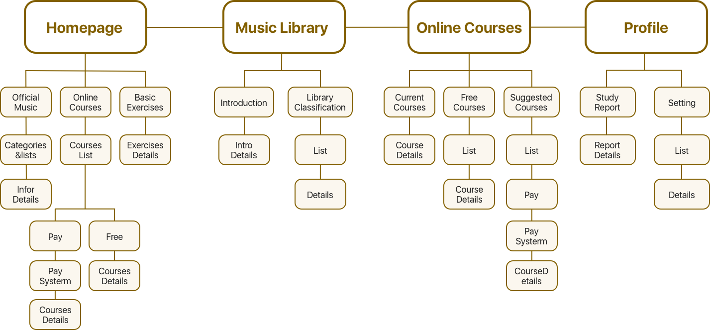
Information Architecture
In the reenvisioning process, we uncovered the gap between our experience and the user needs. We mapped our new features with the IA system to oversee our new structure and content provision. This also helped us plan the design timeline, and section the features into different phases with an agile development process.
Wireframe
Along with the IA system, we then translated the content structure, and user flows to user interfaces and interactions. The wireframes followed the standards of Human-centered Interface on iOS and Android platforms so that users could play the app with a minimum learning curve.


Branding
I'm not only a UX/UI designer but a hybrid designer that contributed to building a more engaged eco-system for my client. The best metaphor to represent an educational application is blending a treble clef with a book, with a bright orange color. The new icon communicates a distinct functionality of the app and a promise to users.

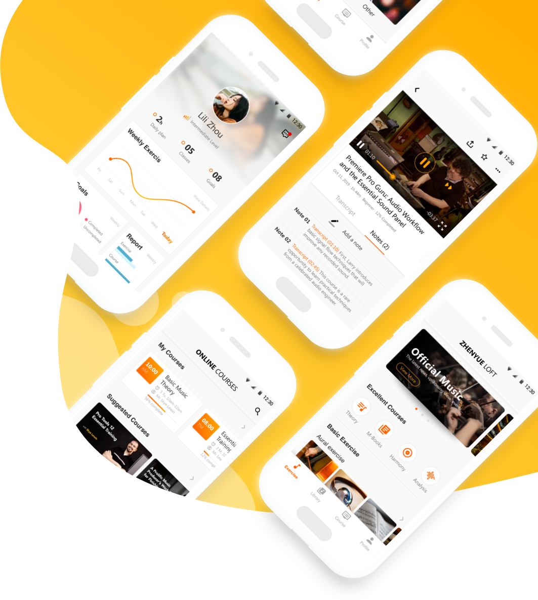
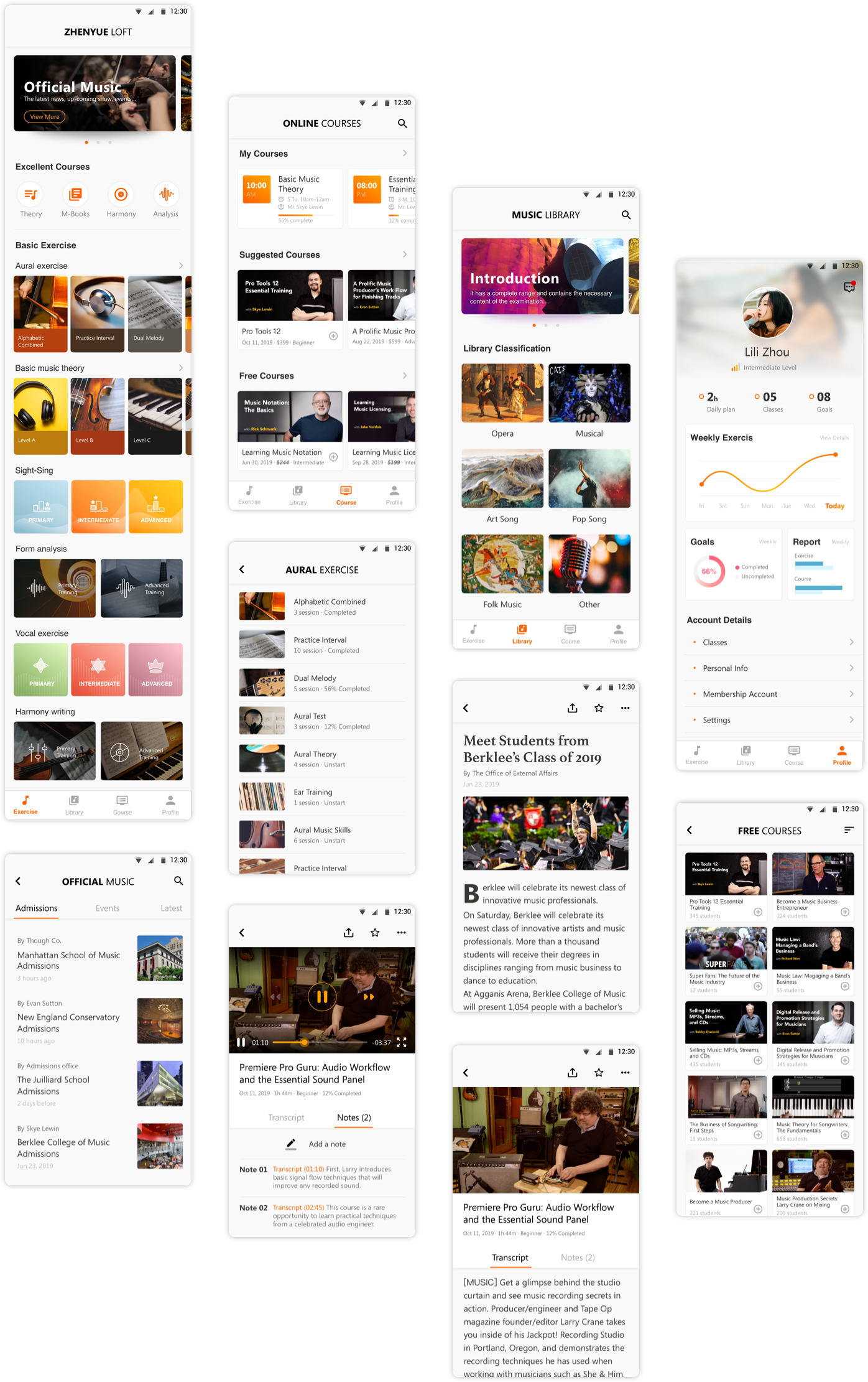
Visual Design
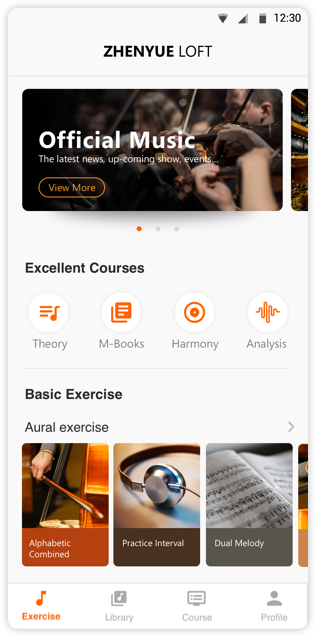
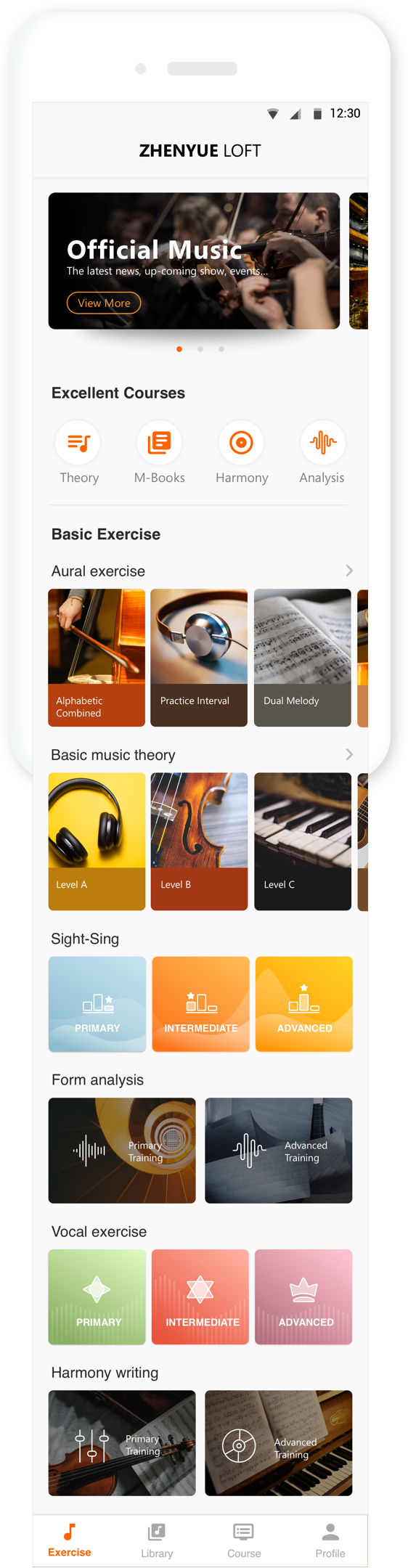
HOMEPAGE
Elegant and decent homepage
with a warm color association
COURSE LIST
Shortcuts to whatever courses interest users
in just a few steps

PROFILE
Personalized user profile page celebrates achievements

Selected Works


© YING ZHAO